Festoso Regular
- Digital2,640 JPY


●Eccentric and Diverse Multilingual Typeface Festoso 9 Weights Font Family / OpenType ●破天荒でバラエティに富んだ多言語欧文 Festoso 9ウェイトファミリー / OpenType
■About Festoso
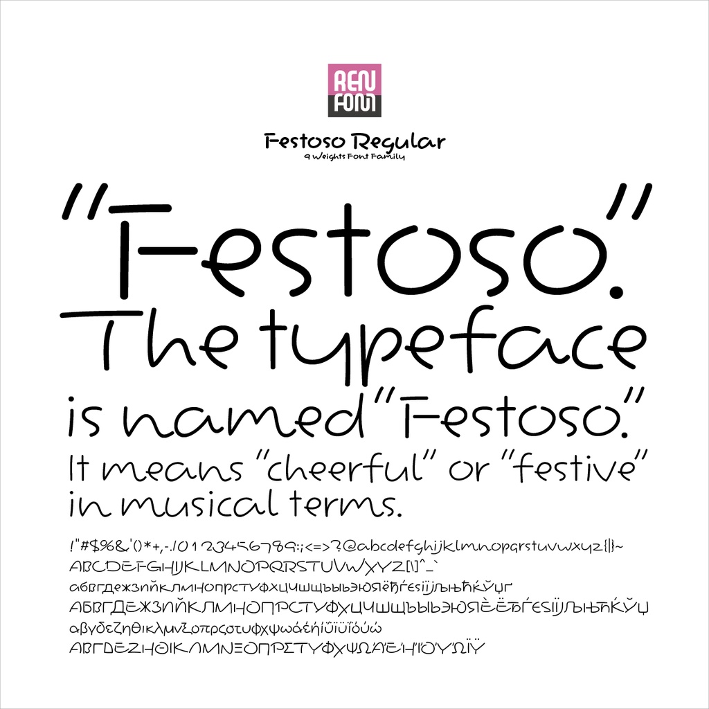
Designed as a Companion to “Hommaru-Kana” As Festoso was created as the Latin companion to Hommaru-Kana, it naturally reflects the distinctive characteristics of Honmaru-Kana in its design. While our general policy is to design companion Latin scripts in a relatively orthodox style, Festoso was developed as a script typeface to maintain consistency with the playful and expressive nature of Hommaru-Kana. This typeface is based on the everyday handwriting of our type designer, Kazuo Kanai. It features a uniquely rounded form with subtle traces of brush lettering. The family consists of nine weights, ranging from Extra Light (EL) to Heavy (H).
■Festoso について
「ほんまるかな」の従属書体として設計 “Festoso” は「ほんまるかな」の従属欧文として制作されたため、そのデザインには当然ながら「ほんまるかな」の持つ特徴が反映されています。 当社では、従属欧文は比較的オーソドックスな書体で設計する方針を基本としていますが、“Festoso” に関しては、「ほんまるかな」の持つ遊び心や表情豊かさとの整合性を保つために、あえてスクリプト体(手書き風書体)でデザインしました。 この書体は、当社タイプデザイナー金井和夫の普段使いの文字をベースとしてデザインされたものです。わずかに筆文字の痕跡を残した、一風変わった丸文字的フォルムイメージを持っています。「EL(エクストラライト)」から「H(ヘビー)」までの、9ウェイトで構成されています。
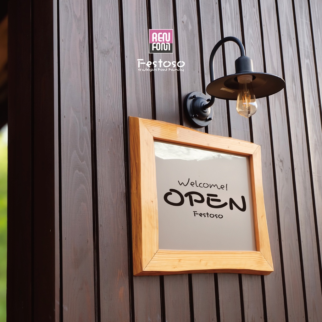
■Characteristics of Festoso
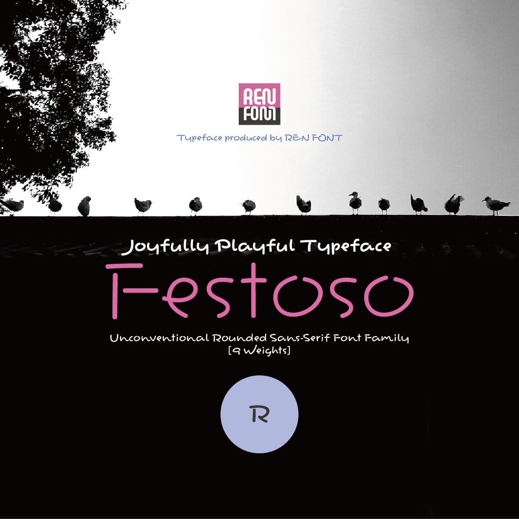
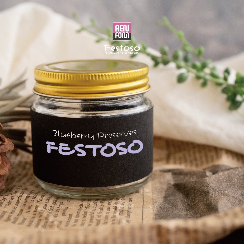
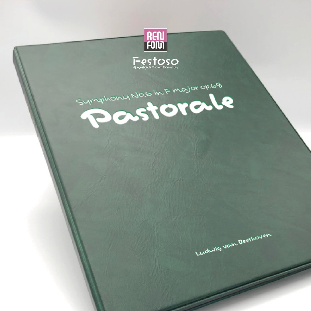
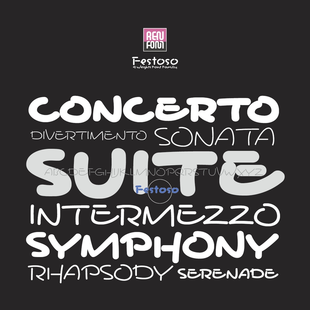
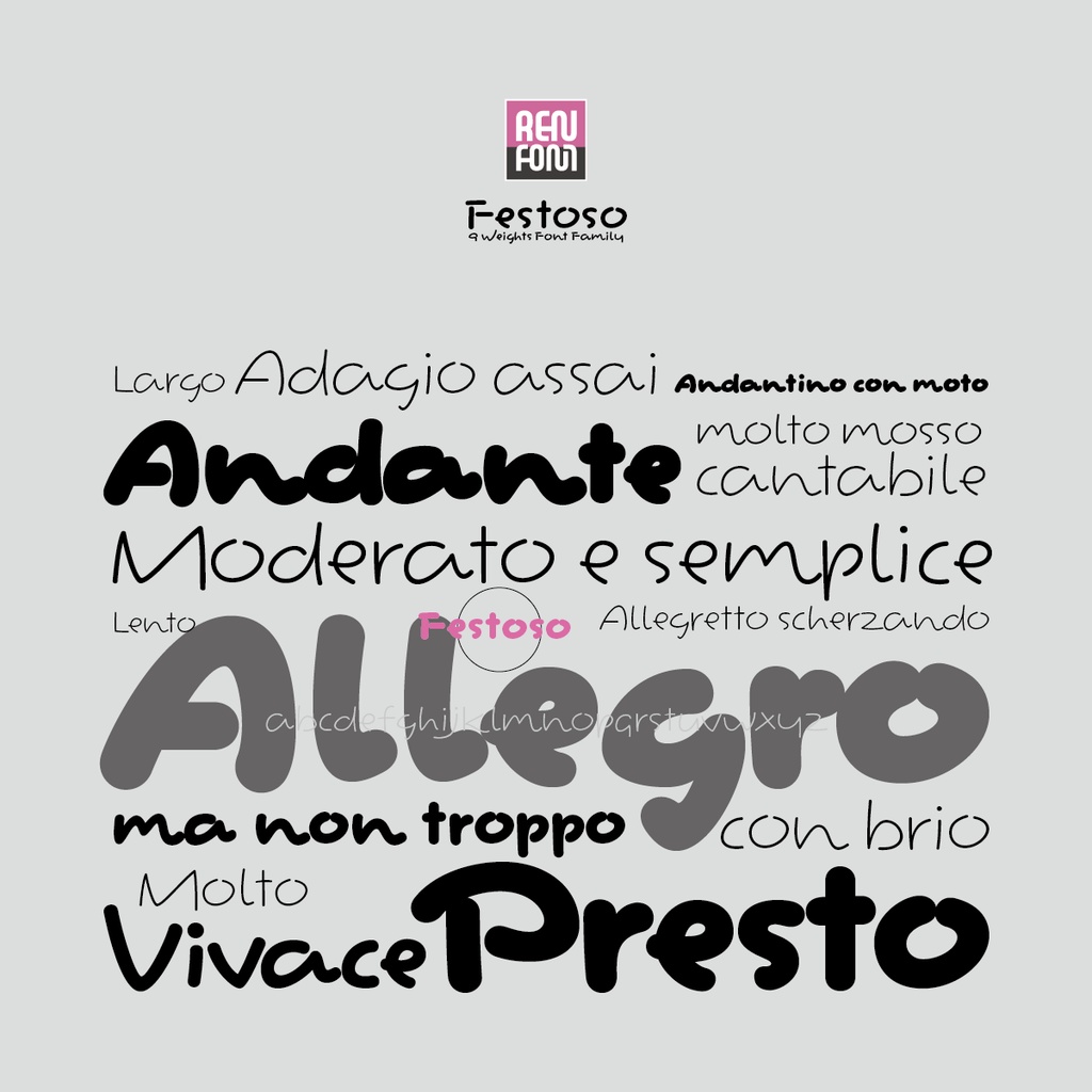
The typeface is named “Festoso.” Festoso is an Italian musical term that means “cheerful” or “festive.” In musical contexts, it instructs the performer to play in a lively, joyful, almost celebratory manner. This typeface, Festoso, captures that same festive spirit. Some characters bounce energetically, while others come to a sharp, sudden stop. Unpredictable and full of variety, it’s a rhythmically expressive and boldly unconventional design. Just using it lifts your spirits—it’s a font that brings joy, unconditionally. The Five Guideline Lines Are Largely Ignored In Western typography, beauty is typically achieved through adherence to five standard guideline lines: ascender, cap height, mean (x-height), baseline, and descender. These provide a natural sense of order and harmony. However, Festoso treats these baseline structures as mere guidelines. By intentionally breaking away from them, it creates an irregular rhythm that adds playfulness and cheerfulness to the entire typeface. As its name suggests, it has a joyful and lively character. Extremely Wide Set Width As a result of its script-style design, some characters have an exceptionally wide set width. While this makes the typeface less suitable for long-form text, it produces a distinctive visual effect in shorter phrases and headlines. Incorporating the charm of 'hané' (brushstroke flicks) The finishing strokes of [a], [h], [j], [k], [l], [m], and [n] are deliberately designed to incorporate the characteristic "hané" (upward flick). These are relatively frequently used letters, and they naturally add a lively rhythm to the text. Meanwhile, the Cyrillic and Greek characters have been designed more modestly to maintain legibility. Deliberately Breaking the Rules with Capital Letters The capital letters are intentionally designed with disrupted balance. For example, take the letter [A]—its apex (the pointed top) has been dramatically shifted to the right. At first glance, one might mistake it for italic. We took the boldest leap right at the beginning of the alphabet. In addition, we altered the balance of other letters with a two-tiered vertical structure. For letters like [H], [K], [P], [R], [S], [X], and [Y], the visual center of gravity is intentionally placed on the opposite side from what’s typical. Meanwhile, letters like [B], [E], [F], and [G] feature exaggerated contrasts between their upper and lower halves, enhancing the rhythmic flow of the text. Pair Kerning for Latin, Cyrillic, and Greek Scripts In the Latin, Cyrillic, and Greek character sets, pair kerning has been applied to side bearings where proportional metrics alone could not adequately address awkward or unnatural spacing.
■Festoso の特長
この書体の名前は「Festoso(フェストーソ)」です。 Festoso はイタリア語の音楽用語で、「陽気な」「楽しい」といった意味があります。音楽においては、演奏を陽気に、お祭りのように明るく行うよう指示する際に使われる表現です。 この書体 Festoso も、まさにそのお祭りのような陽気さを表現しています。跳ねる文字もあれば、ピタッと止まる文字もあり、予測不可能でバラエティに富んだ、リズム感あふれる破天荒なデザインです。使っているだけで気分が高まり、無条件に楽しくなってくるフォントです。 5本の基準ラインは基本的に無視 欧文タイポグラフィでは、アセンダー、キャップハイト、ミーンライン(xハイト)、ベースライン、ディセンダーという5本の基準ラインに従うことで、自然な秩序と調和が生まれ、美しさが備わるのが一般的です。 しかし “Festoso” は、これらの基準ラインをあくまで「参考程度」として扱っています。意図的にこの構造を崩すことで、不規則なリズムが生まれ、書体全体に遊び心や陽気さが加わります。その名が示す通り、楽しく軽快な印象の書体となっています。 極端に広いセット幅 スクリプト風のデザインにした結果、いくつかの文字は非常に広いセット幅を持つようになりました。これにより長文にはあまり適しませんが、短めの文章や見出しでは独特の視覚効果を発揮します。 “跳ね(筆の跳ね上げ)”の魅力を取り入れる [a]、[h]、[j]、[k]、[l]、[m]、[n] の収筆には、意図的に「跳ね」の特徴を取り入れています。これらは比較的使用頻度の高い文字であり、文章に自然と軽快なリズムをもたらします。一方で、キリル文字やギリシャ文字については、可読性を考慮して控えめなデザインにしてあります。 あえてセオリーを崩した大文字 大文字は、意図的に重心のバランスを崩したデザインになっています。たとえば [A]。アペックス(上部の尖った部分)を大きく右にずらしています。一見すると「イタリック体かな?」と錯覚するほどです。アルファベットの最初の文字で、最も大胆な試みに挑みました。 また、上下2段構造を持つ他の文字についても、[H]、[K]、[P]、[R]、[S]、[X]、[Y] などは、本来とは逆の位置に重心を置いています。[B]、[E]、[F]、[G] では、上下のコントラストを極端にすることで、文字全体により大きなリズムを生み出せるようにしています。 ラテン、キリル、ギリシャ文字にペアカーニング ラテン文字、キリル文字、ギリシャ文字の各文字セットにおいて、プロポーショナルメトリクス(文字幅の比率)だけでは十分に対応できない、不自然な“アキ”(空き)が発生するサイドベアリングに対して、ペアカーニングを施しています。
■Weights
Complete family ExtraLight Light Regular Medium DemiBold Bold ExtraBold Black Heavy
■ウェイト
フルウェイト エクストラライト ライト レギュラー ミディアム デミボールド ボールド エクストラボールド ブラック ヘビー
■Recorded Characters
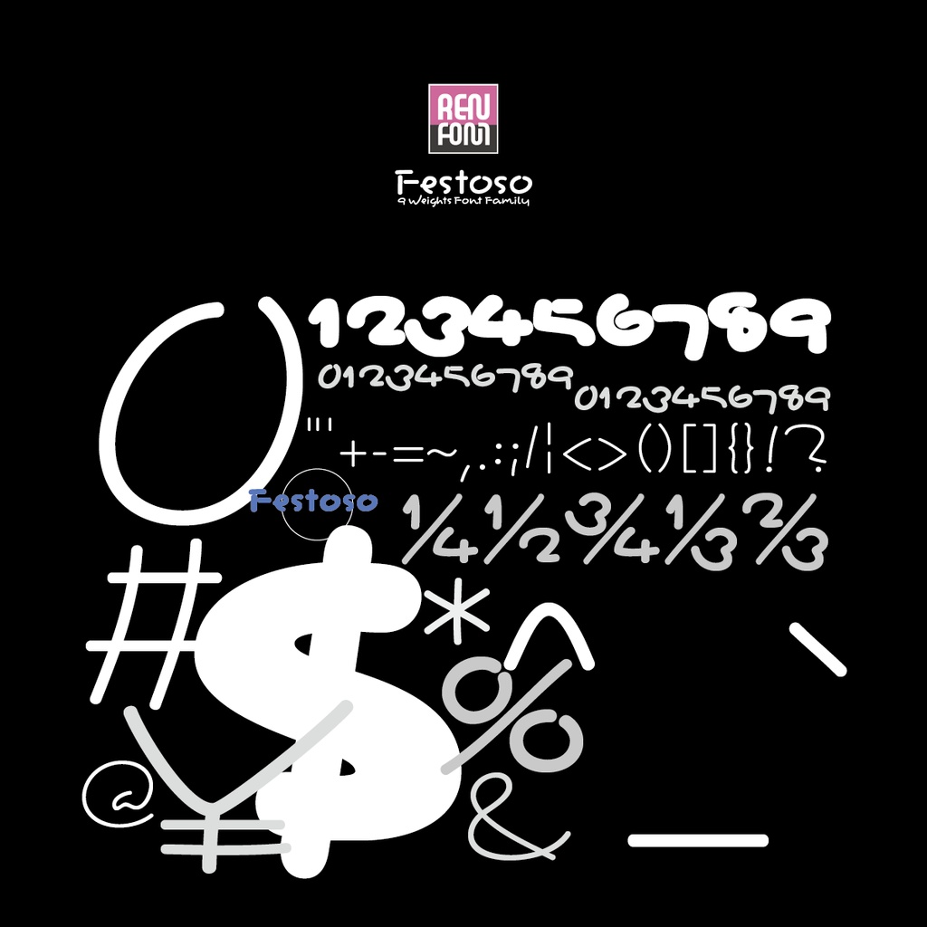
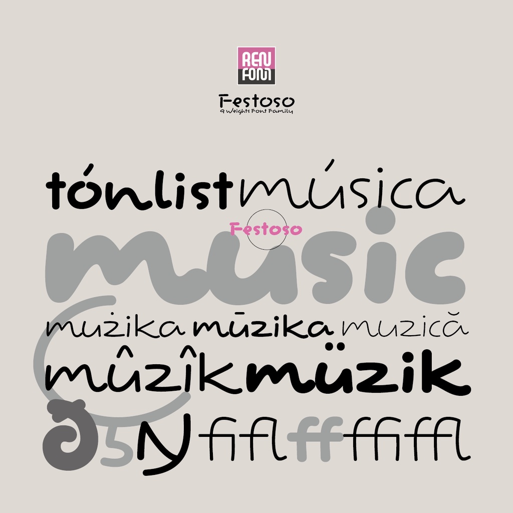
Basic Character Unicode Variants OpenType Variants Latin Diacritics Latin 1 Supplement Latin Extended-A Additions for Romanian Miscellaneous addition Cyrillic Greek
■収録文字
収録文字 : W1G準拠 607文字 基本文字 Unicode バリアント OpenType バリアント ラテンダイヤクリティクス ラテン補助 ラテン拡張A ルーマニア語用追加 その他の追加 キリル文字 ギリシャ文字
■Operating environment
Macintosh Hardware / Macintosh running any version of MacOSX 10.0.0 or later up to macOS 15 without stress. Hard disk space / 4MB of hard disk space per one weight. * OpenType can continue to be used even if the OS version is upgraded in the future. * Technically, it can be displayed and printed on MacOS 8.6 to 9.2.2 and MacOS X 10.0 to 10.9 with ATM installed, but it is not supported in accordance with Apple's support cycle. Windows Hardware / PC/AT compatible machine that can run Windows2000, WindowsXP, WindowsVista, Windows7, Windows8, Windows8.1, Windows10 or Windows11 without stress. Hard Disk Space / 4MB of hard disk space per one weight. * OpenType can continue to be used even if the OS version is upgraded in the future. * Technically, it can be displayed and printed on all of the above versions, but Windows 8.1 and earlier are not supported in accordance with Microsoft's support cycle.
■使用環境
Mac ●ハードウェア / MacOSX 10.0.0 以降 macOS 15までの各バージョンのいずれかがストレスなく動作する Macintosh ●ハードディスク容量 / 1ウェイト毎に4MBのハードディスクスペース ※OpenTypeは、将来的にOSのバージョンが上がっても継続してご利用いただけます。 ※技術的には ATM をインストールした MacOS 8.6〜9.2.2、MacOS X 10.0〜10.9 で表示・印刷は可能ですが、Apple 社のサポートサイクルに則り、サポート対象とはしておりません。 Win ●ハードウェア / Windows2000、WindowsXP、WindowsVista、Windows7、Windows8、Windows8.1、Windows10、Windows11 の各バージョンのいずれかがストレスなく動作する PC/AT 互換機 ●ハードディスク容量 / 1ウェイト毎に4MBのハードディスクスペース ※OpenTypeは、将来的にOSのバージョンが上がっても継続してご利用いただけます。 ※技術的には 上記すべてのバージョンで表示・印刷は可能ですが、Windows8.1 以前は Microsoft 社のサポートサイクルに則り、サポート対象とはしておりません。
■Typeface addition function
This typeface incorporates Apple's Apple Advanced Typography program and Adobe's Font Extensions program, so you can use the following additional functions. PDF font embedding function Adobe Acrobat 4.0J or later These applications can embed this typeface when converting PostScript files to PDF files. Since "Editable embedding" is allowed as an embedding pattern, even once a PDF is embedded, the characters can be edited in the Acrobat application in the customer's environment where this typeface is officially used.
■書体付加機能
本書体は、アップルコンピュータの Apple Advanced Typography(書体付加機能)プログラムおよび Adobe フォント拡張機能プログラムを内蔵していますので、以下の付加機能をご利用いただけます。 PDF フォント埋込機能 Adobe Acrobat 4.0J 以降 これらのアプリケーションでは、PostScript ファイルから PDF ファイルへの変換時に本書体を埋め込むことができます。 埋込パターンとして「編集可能埋込」許可をしておりますので、一度 PDF 埋込をした PDF でも、本書体を正規使用されているお客様の環境では Acrobat アプリケーションにて文字の編集が可能です。
■Details of typeface specifications, license information, etc.
Please refer to the official website. Details of typeface specifications: https://www.renfont.com/details.html License Terms: https://www.renfont.com/license.html Introduction of typeface author: https://www.renfont.com/author.html
■書体仕様の詳細・ライセンス情報など
オフィシャルサイトをご参照ください。 書体仕様の詳細:https://www.renfont.com/details.html ライセンス条項:https://www.renfont.com/license.html 書体作者の紹介:https://www.renfont.com/author.html